
-
 Office Timings Mon - Fri 09:00 am 5:00 pm
In the modern market, sustainable packaging is taking over. Lately, brands have been using green packaging materials. This allows them to abide by the standards of packaging authorities. Moreover, it helps attract a huge audience of eco-conscious consumers.
Nowadays, the fusion of green materials with packaging styles is in trend. Brands are making use of custom cardboard boxes with chic designs. What does this do? It helps them to attract many consumers with both the quality and aesthetic.
Cardboard is among the most utilised packaging materials. It is one of the retailer’s favourites due to its timeless benefits. 90% of consumers purchase from a brand that uses sustainable packaging. These figures also prove why brands prefer cardboard packaging.
70% of consumers globally look for such brands that use eco-friendly packaging. Therefore, if your brand wants to elevate its custom cardboard packaging, then it will be through design. These packaging materials, from a quality aspect, are already high-end.
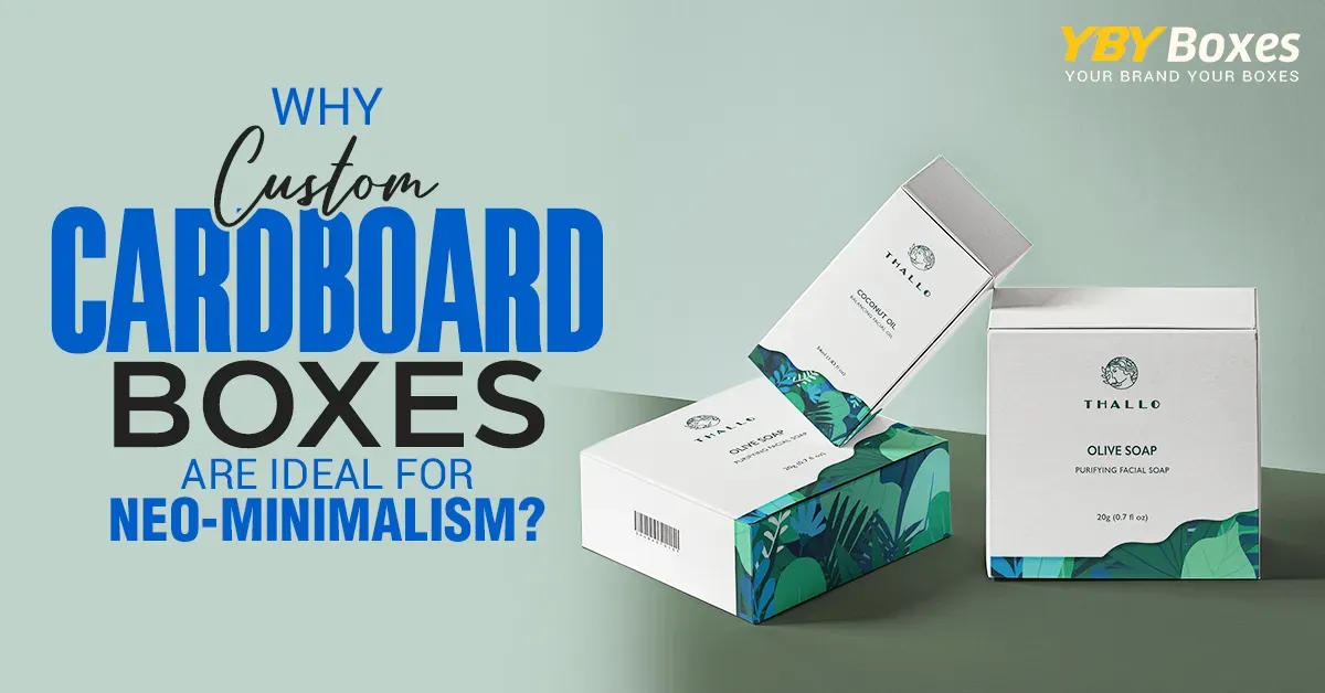
So, go trendy. Try neo-minimalism for your sustainable packaging boxes. To learn more about this style, continue reading.
Neo-minimalist packaging is a development of classic minimalism, infusing white space, geometric shape, and stark contrasts with sustainable materials, intelligent structures, digital integration, and tactile finishes that captivate while being eco-friendly.
Cardboard packaging is considered an all-in-one due to its endless demand. 60% consumers deliberately look for minimal packaging in the market. Cardboard packaging is the epitome of minimalism.
This is one of the reasons why it is advised that modern brands try neo-minimalism. This form of minimalism helps upgrade the appeal of your custom-printed cardboard boxes. Moreover, you can customise them into cardboard dividers or more.
Cardboard inserts can also be customized with the same aesthetic. Creating various types of custom cardboard boxes will help attract consumers from diverse industries. This allows your brand to make a global-level business.
Strong contrast is achieved by using plain white or neutral colours as a background with one bold accent colour. This colour can be vibrant, dark or metallic and will be used as the accent colour to immediately draw the eye. It makes the product stand out but not at the detriment of the overall look of the packaging design.
This technique draws the viewer’s attention to certain branding elements, including logos or product titles. Metallic foils and high-gloss accents bring depth and dimension to the image. The result is a packaging that looks bold and high-end.
Negative space permits designs to breathe and have us feel wrinkles in the fabric of space. Blank space will make only what you really need to show off on your packaging pop out. That leads to a calm and sophisticated visual effect.
With less visual clutter to the brand, they portray a sense of clarity and assurance. The item looks more elegant and deliberate. This method also enhances the ease of reading and shelf appeal.
Geometric forms add structure and balance to the packaging design. Straight lines, squares and rectangles, as well as patterns, give the design a modern and clean look. They imply accuracy and progressiveness.
These shapes suggest industrial, space-age or high-end styles. In doing so, they are an enhancement to the branding, rather than a distraction. The design is clean, strong and up-to-date.
Tactile finishes provide a physical dimension to visual design. Embossing, debossing and graining invite consumers to touch the packaging. This creates a stronger emotional tie with what they’re buying.
The presentation of the product, natural and luxury materials, for instance, implies more value. The textured finishes make the unboxing experience even better. The packaging is a little thoughtful and luxurious.
Eco-visibility represents sustainable principles, but not at the expense of looking good. Packaging made from recycled material or the same type of material signals responsibility with a glance. With minimal materials, which highlight the product’s environmental ethos.
Refill systems and packaging formats that minimize waste help convey the eco-friendly message. Sustainability isn’t hidden behind design choices; it’s part of the design choices. This gives you a connection with socially aware customers.
Digital elements connect the physical package to the digital world through experiences. QR codes can lead consumers to product stories, uses or values of the brand. It adds dimension outside the box.
AR-enabled aspects foster even more engagement and interactivity. Consumers were informed, and they were engaged with the brand. Packaging isn’t simply a container; it’s a portal.
The simple, clean typeface brings clarity and elegance. Bold-rounded clean font style, which makes the message easily readable and visually impactful. Minimal serifs lend a timeless elegance.
A couple of fonts are only used in order to keep the layout cohesive. Typography plays the brand part but not the starring role. The general appearance is still clean and classy.
Neo-minimalism is more than just a design style that’s trending. It’s an intentional way of showcasing clarity, value and sustainability. Brands that interpret it assert themselves boldly and with intent. At YBY Boxes Canada, we apply these principles of great design to packaging that really works.
Are you ready to enhance your packaging experience? Get a quote today and receive custom solutions for your brand. For expert consultation and one-on-one support, contact us and let’s design packaging that speaks for itself.